
Choosing Colour
Choosing colour is an important, often overwhelming task. Appreciation and use of colour is such a personal thing and the way we each view a colour and our instinctive reactions to colour are so individual: be it a personal association with a particular colour, or cultural and traditional associations with colour.
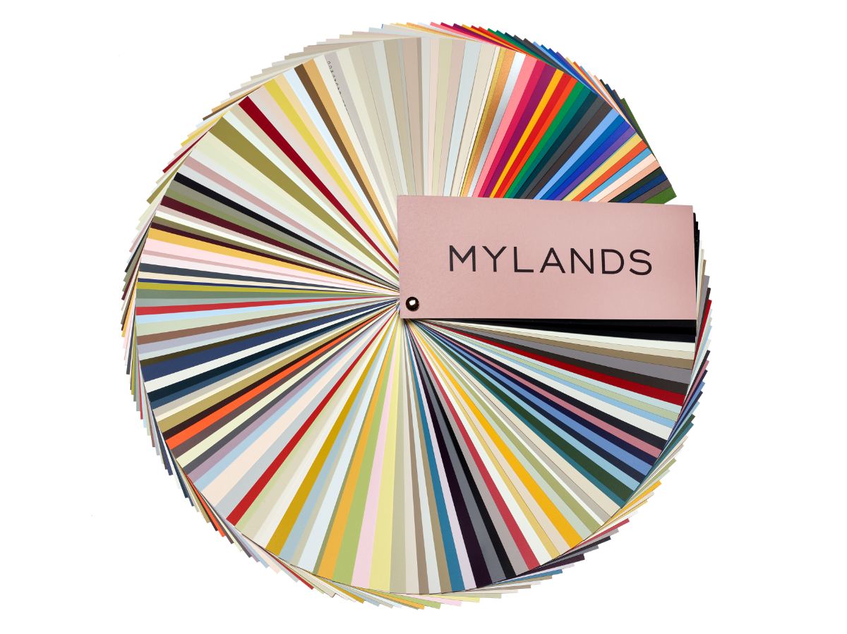
At Mylands, we have carefully refined our three core collections: Colours of London (a refined palette of 120 timeless colours in a range of colours to suit both interior and exterior paint finishes), Greys & Neutral (24 colours) and Film, Television and Theatre Collection (20 colours).
We’ve produced this guide to choosing colour with some useful tips and advice to help you get started. Also, when you browse colours in our online store, we’ll show you colour schemes created by our colour experts using each colour in the Mylands palette.
160+ TIMELESS COLOURS
Paint has the power to transform a space, with colour setting the tone and creating mood. The shape, purpose and style of your room or property can all affect colour, as well as its direction and light – both natural and artificial - and how it changes throughout the day.
Before you begin to choose a decorating scheme, it’s a good idea to think about the look you’re aiming to achieve and how you will use the space. If you’re painting a dining room, cloakroom or hallway – where you spend less time or pass through quickly - you can afford to be more daring if you wish.
Most importantly, choosing colour is a personal thing. Think carefully about the colours you are comfortable with before selecting a scheme that feels right for you.
Helpful Tips
Colour can be subtle or significant for a striking statement or tasteful backdrop. Begin by thinking about:
- Mood – consider the mood and ambiance you’re looking to create. In a bedroom, do you want the feeling to be calm and tranquil or dramatic and intimate? Colour affects mood with soft, cool colours usually creating a quieter feeling while stronger colours create drama.
- Function – consider the function of your space. In a dining room or kitchen, do you want a stimulating sociable environment or a formal entertaining space? Warmer, contrasting – and brighter – colours will create a friendly atmosphere while deeper blue, green and neutral colours will achieve a more formal feel.
- Consider the effect that colour has on space – warm colours (red, orange, yellow) advance towards you while cool colours (green, blue, lilac) recede. With this in mind, colour can be used cleverly to change the shape of a room or to create the illusion of space.
- Features - If you’re nervous about using colour but still want to make a statement, choose a small room such as a cloakroom or consider an accent or feature wall. This way, you can experiment without too much commitment – painting a small area means you’ll see the results sooner and you can change it more easily if you wish.
- Flow – consider how colours relate to one another in your home. If you’re decorating a hallway, think about how the colours in adjoining rooms interact, especially if you live with doors open most of the time. Try to make colours in adjacent rooms harmonise or contrast rather than clash. Another trick is to ensure that colours share the same weight to achieve balance; a deep blue for example with pastel pink will create imbalance whereas an equally weighted soft shade of the two colours will achieve a more seamless flow. Of course, intentionally unbalancing colours is a great way to achieve an unexpected edgy look.
Sample Pots
It’s always best to test your final selection of colours in situ using sample pots. All 120 Mylands colours are available in 100ml sample pots of Marble Matt Emulsion. This allows you to view colours in the correct light and situation - throughout the day - to ensure you get an accurate feel for how the room will look.
Remember to view the paints horizontally on walls rather than vertically – paint a large piece of paper or thin cardboard and move around the room to view in various positions. If possible, view the colours alongside fabrics and furnishings or swatch samples to help visualise your colour scheme with other important elements of your room.

HOW MUCH TO ORDER
Quantity Advice
CHOOSING A COLOUR
COLOUR ADVICE
CHOOSING A FINISH
FINISH ADVICE
Preparation & Application
Get it right first time